Wednesday, February 28, 2018
EYE LEVEL AND BASELINES
The class continued working on their series of drawings. We will work on these all next week as well.
Monday, February 26, 2018
EYE LEVEL AND BASELINES
 |
| Julianne |
For the next two class sessions, we will work on creating a series of at least three drawings illustrating the three locations of horizon line (aka. eye level).
Monday, February 19, 2018
NO CLASS MONDAY OR WEDNESDAY: Work on the "List"
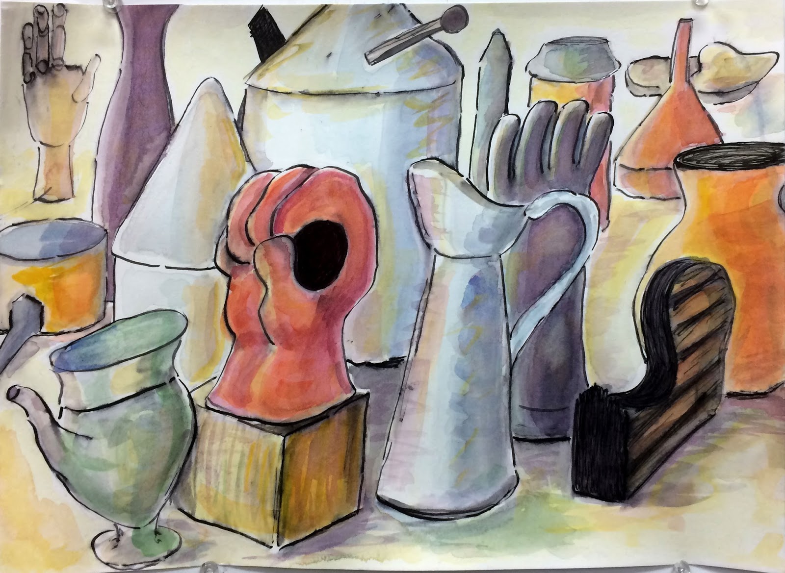
No class this week due to teacher absence. Continue working on the "List" project. Feel free to develop some of these sketches into more complete drawings but it is best to have multiple views rather than one single rendering of the object. Remember, you are trying to familiarize yourself with these items. Draw what is important and "get to know" the objects. You will be using them in a larger composition in a couple of weeks. Below are some examples from Joy's sketchbook.


Friday, February 16, 2018
COLOR: Watercolor and Ink
Yesterday the class added watercolor to the ink drawings from Monday. Students explored multiple techniques of wet on wet to wet on dry.
Joy has effectively rendered the local colors of objects by using layered applications of color to build up the values. Notice how she uses warm colors towards the light source and cool colors in the receding and shadow areas. In addition, she has applied a final glaze of yellow over the objects adding depth and luminosity.
Emily started with a very complete ink drawing in black and white before adding color. She has very skillfully located similar colors in diagonal locations to unite the elements strengthening the compositional balance.
 |
| Joy |
 |
| Emily |
Tuesday, February 13, 2018
WATERCOLOR: Atmospheric Perspective

Thursday, February 8, 2018
COLORED PENCILS: Personal Theme
The class continued working on their drawings exploring a personal theme. These drawings will be critiqued on Monday.
Dylan has created a pop surrealist image of cosmic desserts and interstellar birdies. This humorous display of his subconscious is well balanced with repeating shapes as well as colors. "Everyone knows the moon is made of cheese."
Jesse has created a very bold composition by engaging with all four sides of the paper. Notice the triangulated rhythms between the blue, rectilinear forms and the spheres.
Judy has also entered the realm of Pop Surrealism with her rendition of "Mr. Potato Head consulting his dog." She has skillfully addressed the value and color patterns observed across the forms. The layering of colors (notice the reds and oranges within the brown) is similar to "glazing" techniques in painting which adds depth and luminosity to the forms rather than flat, "cartoonish" qualities.
 |
| Dylan |
 |
| Jesse |
 |
| Judy |
Tuesday, February 6, 2018
COLOR PENCILS: Personal Theme
 |
| Patti |
Thursday, February 1, 2018
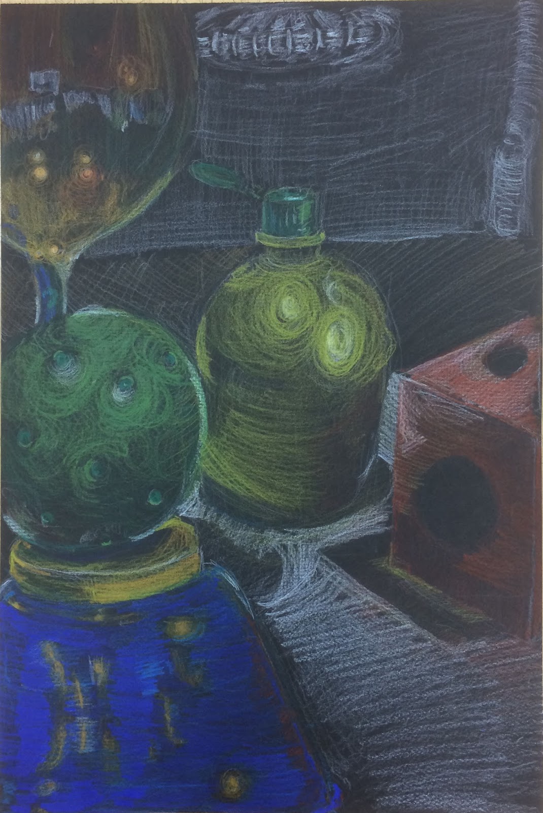
COLOR PENCIL: Still Life
Yesterday the class made color pencil drawings from a still life. The three drawings above illustrate very different techniques in the handling of the materials.
Jose has applied a very light touch in rendering the color patterns observed on the various objects. By allowing the paper to show through many of the objects the positive and negative areas are united while creating a dreamy, surreal atmosphere.
Julianne has employed a more dense and saturated application of the medium. The colors are bold and rich. Notice the rhythm established by the placement of red and orange hues.
Nick's approach is more expressive in comparison to the previous two. The strokes and marks from the pencil swirl around the light patterns adding energy and dynamics to an otherwise stationary composition.
 |
| Jose |
 |
| Julianne |
 |
| Nick |
Subscribe to:
Posts (Atom)